Global
Header
An important part of a website is its header. It represents the part you usually see on top of every website. It allows easy navigation across the main pages.
Desktop
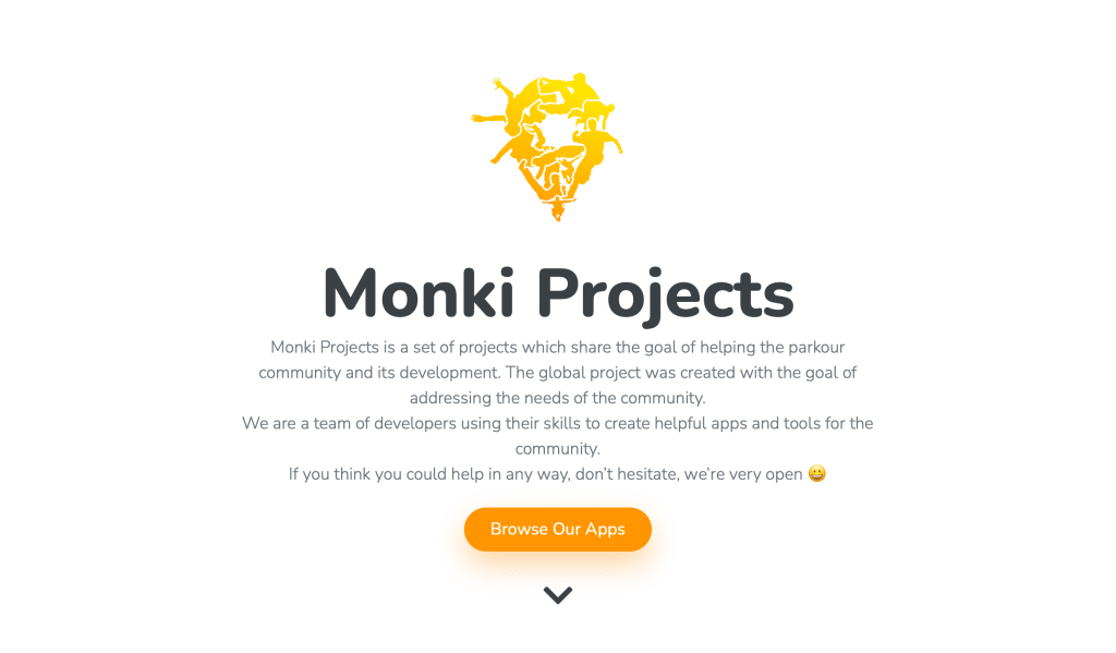
In our old header, the Monki Projects logo used the Monki Map app icon.
It led to a lot of confusion, so I decided to use a more neutral icon, without the background and rounded corners like you’d see in the App Store.
Old header (light mode only)
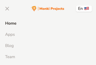
New header in light mode
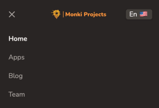
New header in dark mode


Landscape mobile
On landscape mobile, the header icon was too big. It required a the burger menu button with a foldable navigation. It also hid the language selector, making it unclear that the page was translated.
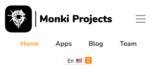
In the new version, I replaced the horizontal logo with an “icon-only” logo. It allowed me to get rid of the burger menu button and I ended up with a cleaner design. You will possibly not notice it, but the icon is different in light and dark mode (colors are lighter in dark mode).

Old header (landscape mobile)

New header in light mode (landscape mobile)

New header in dark mode (landscape mobile)
Portrait mobile
As on landscape, on portrait mobile the header icon was also too big and we could not see the language selector. Also, the burger menu button was the same in open and closed state.
In the new version, I fixed all of this, with a beautiful new design.

Old header (portrait mobile)

New header in light mode (portrait mobile)

New header in dark mode (portrait mobile)
Old header (portrait mobile, expanded)
New header in light mode (portrait mobile, expanded)
New header in dark mode (portrait mobile, expanded)
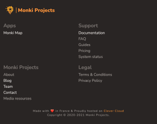
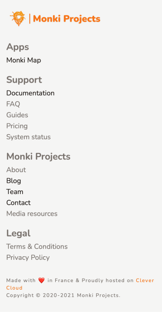
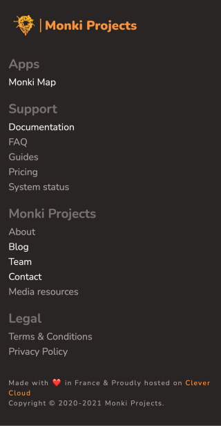
Footer
The footer is similar to the header, but it usually has a lot more data and navigation links than the other.
Desktop
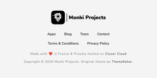
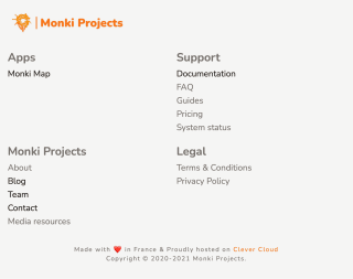
Our old footer was good, but it lacked nested navigation (section names and sub-links).
I went for the simple “column” layout, adding disabled links to make it look nicer and to prepare the arrival of new pages. I also removed the original theme’s developer mention, since I completely rewrote it from scratch and wasn’t very inspired by it anyway.
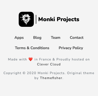
Old footer (light mode only)
New footer in light mode
New footer in dark mode


Landscape mobile
In landscape mobile, I just made the columns look like a grid.
Old footer (landscape mobile)
New footer in light mode (landscape mobile)
New footer in dark mode (landscape mobile)
Portrait mobile
In portrait mobile, I made the grid look like rows.
Old footer (portrait mobile)
New footer in light mode (portrait mobile)
New footer in dark mode (portrait mobile)
Home page
Hero section
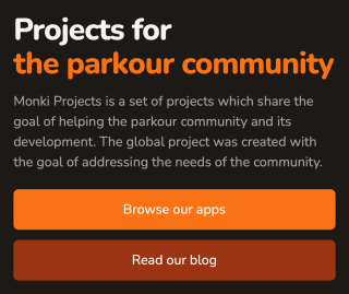
Hero sections are where you explain your product very quickly, and where you attract more customers.
Desktop
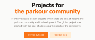
The old hero section was bold and beautiful, but it was also centered. For various reasons, one should generally avoid centering text on a website. I looked at Tailwind UI’s hero sections to find inspiration, and basically copy-pasted the first one 😏
Old home page hero section (only in light mode)
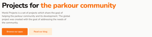
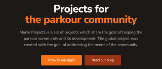
New home page hero section in light mode
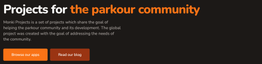
New home page hero section in dark mode
Landscape mobile
I know I just said “one should generally avoid centering text on a website”, but on a landscape mobile, the screen is not too large so it looks fine. I also reduced the length of the text, and as you can see, it’s easier to read now.
Old home page hero section (landscape mobile)
New home page hero section in light mode (landscape mobile)
New home page hero section in dark mode (landscape mobile)
Portrait mobile
On a portrait mobile, everything will be stacked and left-aligned, making it very readable.
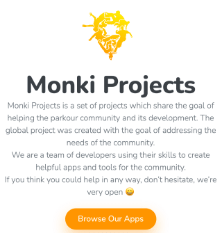
Old home page hero section (portrait mobile)
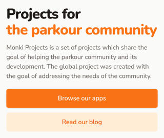
New home page hero section in light mode (portrait mobile)
New home page hero section in dark mode (portrait mobile)
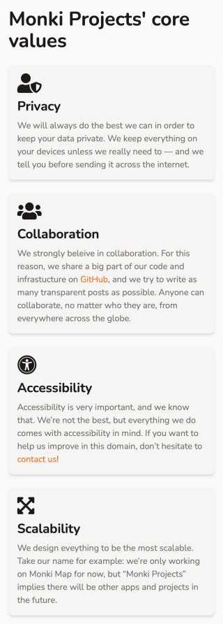
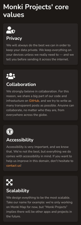
Values
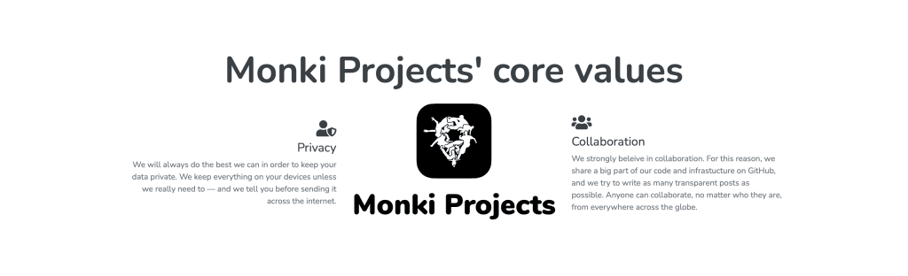
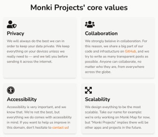
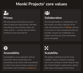
It’s important to communicate our values, and to do it well. The old layout was just a reuse of the app features overview layout, which was not super convenient. I decided to design a card-looking layout to communicate our values.
Desktop
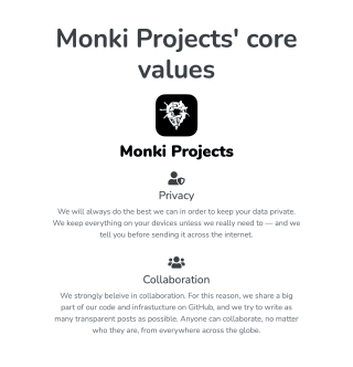
Our core values with the old layout (light mode only)
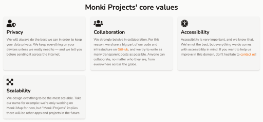
Our core values with the new layout in light mode
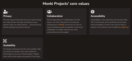
Our core values with the new layout in dark mode
Landscape mobile
Our core values with the old layout (landscape mobile)
Our core values with the new layout in light mode (landscape mobile)
Our core values with the new layout in dark mode (landscape mobile)
Portrait mobile
For readability purposes, all cards are stacked in one column on mobile.
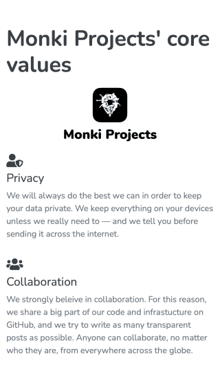
Our core values with the old layout (portrait mobile)
Our core values with the new layout in light mode (portrait mobile)
Our core values with the new layout in dark mode (portrait mobile)
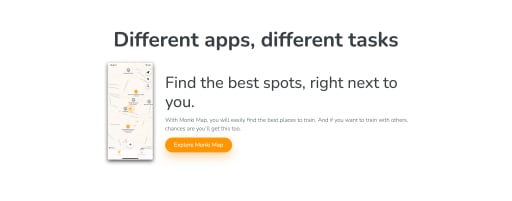
Apps showcase
On our home page, we obviously present our app(s). The problem is, we presented Monki Map, with a link to the app’s page, and then displayed a list containing our apps again.
This was due to the old layout, so we got rid of it. We also added an iPhone frame around the screenshots, to make it look better.
The old home page app presentation (light mode only)
The old app list at the bottom of the home page (light mode only)
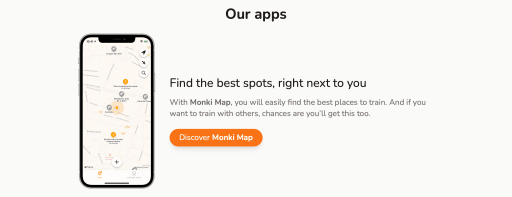
The new home page app presentation in light mode
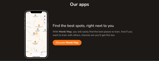
The new home page app presentation in dark mode
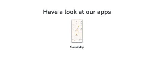
Apps list
The apps list page didn’t change much. We just added an iPhone frame around the screenshots and improved the sizing of elements. It lacks the app icon somewhere, but we’ll add it in the future.

The old apps list (only in light mode)
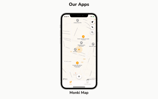
The new apps list in light mode
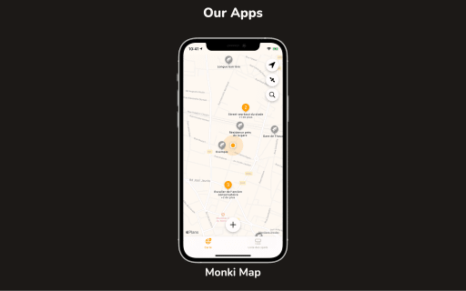
The new apps list in dark mode
App
App screenshots
The old app page layout used an image gallery to showcase features. It was not very responsive, and used Slick, which caused multiple layout problems.
I decided to go with a completely different design, offering the possibility of having descriptions along with the screenshots. The design I realized was inspired by Pitch’s product tour, but I tried to make it as simple as possible. You can’t see it on screenshots, but the images follow the associated text. I suggest you to have a look at Monki Map’s page for an example. As in the apps list, I added an iPhone frame around the screenshots to make it look nicer.
The old app presentation layout (only in light mode)
The new app presentation layout in light mode
The new app presentation layout in dark mode
I don’t need to go into the details, but the layout adapts to the screen size, putting screenshots over text when needed.
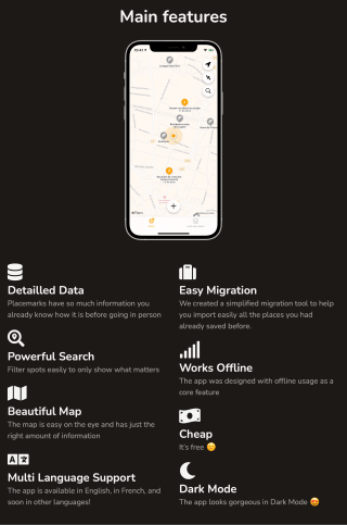
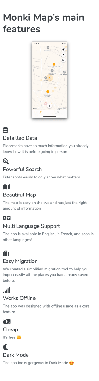
App features overview
To rapidly present an app’s features, we had a design with a screenshot in the middle and features on the sides.
Desktop
On large screens, I kept the idea but added an iPhone frame to make it look nicer.
The old app features overview layout (only in light mode)
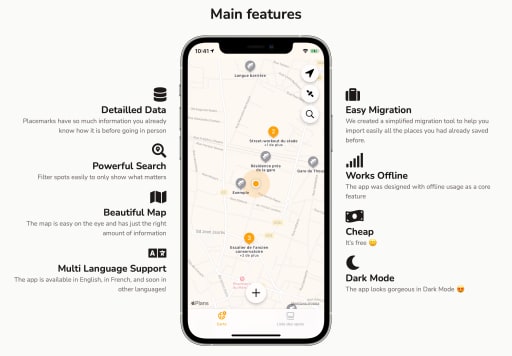
The new app features overview layout in light mode
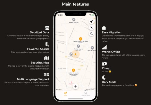
The new app features overview layout in dark mode
Landscape mobile
Center-aligned text is hard to read, so I used a grid of left-aligned items to improve the design.
The old app features overview layout (only in light mode)
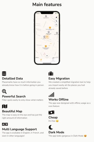
The new app features overview layout in light mode
The new app features overview layout in dark mode
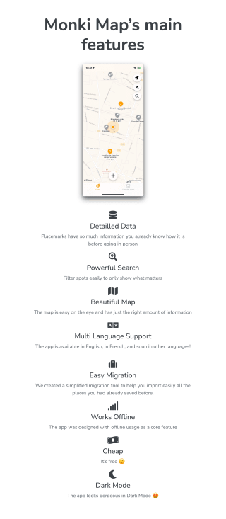
Portrait mobile
On mobile, everything is stacked in a column, so it’s easy to read.
The old app features overview layout (only in light mode)
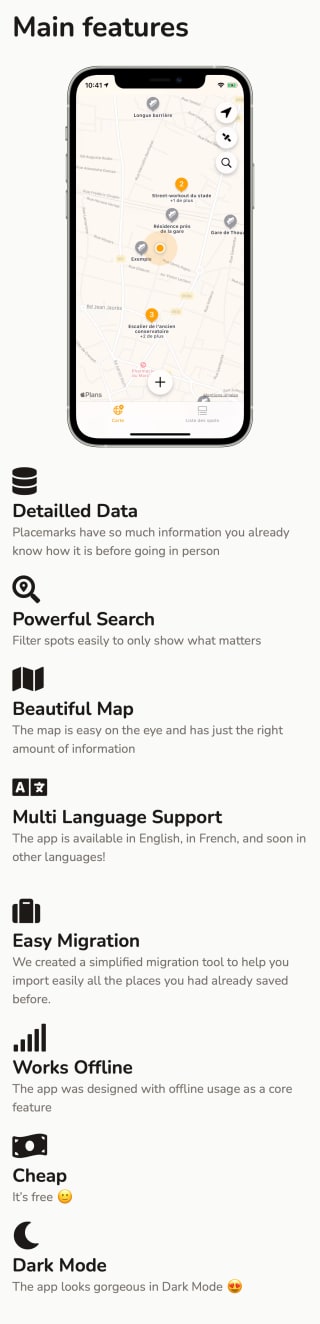
The new app features overview layout in light mode
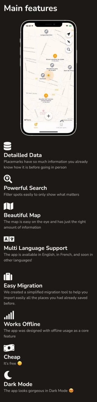
The new app features overview layout in dark mode
Blog posts list
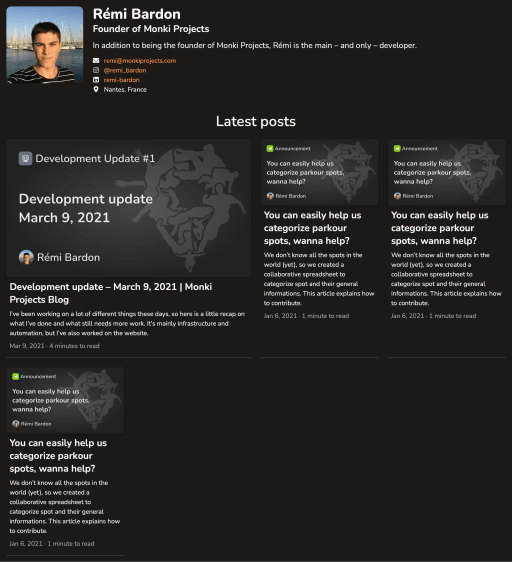
I improved the blog post list a lot, and I really like it now. Before, it was just an ugly grid with fixed size cards. The color contrasts were not good either, especially the white text on green background, so I added a themed blog post cover. For the layout, I got inspired by the simple and beautiful design of Stack Overflow’s “The Overflow” blog.
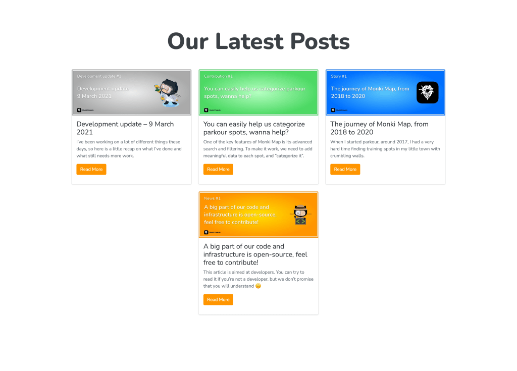
The old blog posts list (only in light mode)
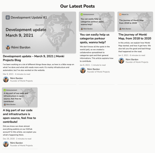
The new blog posts list in light mode
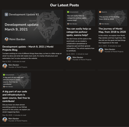
The new blog posts list in dark mode
Blog post
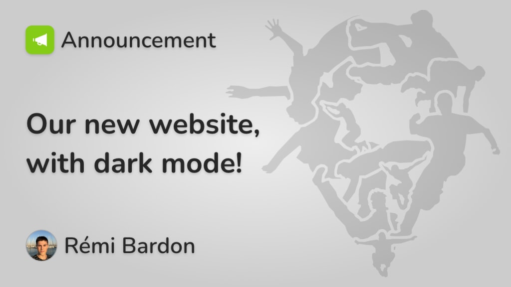
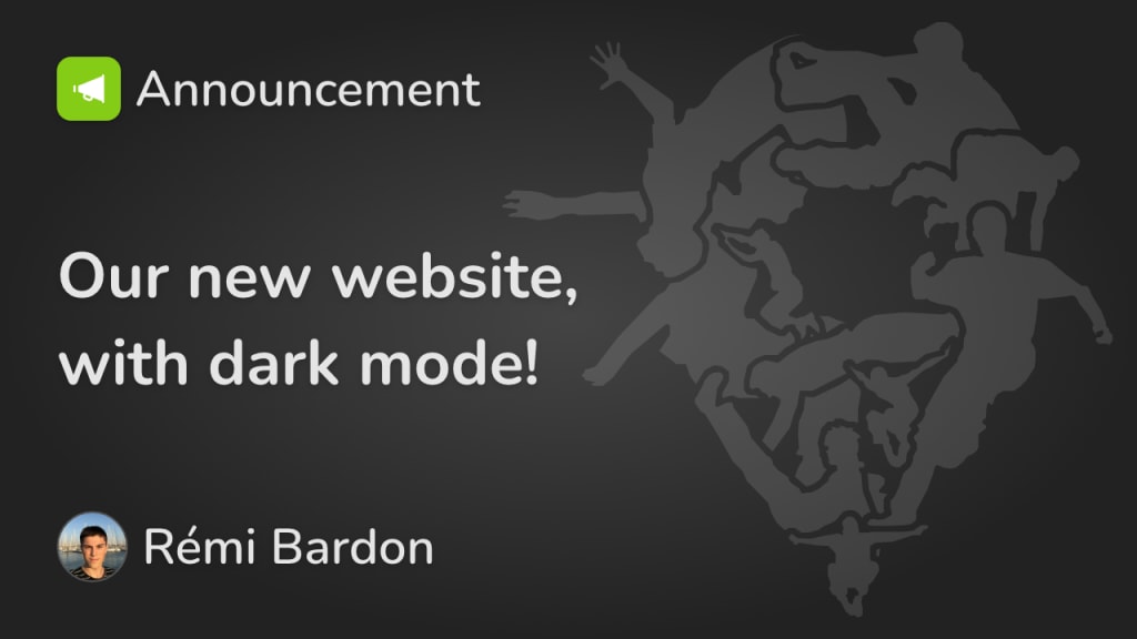
Blog posts didn’t take very long to redesign, since it has a basic structure and layout. I just applied the website’s primary color and moved the author name and upload date to the bottom. I left the reading time there, but it would make more sense if I put it back on top. As for blog posts list, blog post cover images are themed in both light and dark mode.
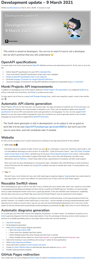
A blog post in the old layout (only in light mode)
A blog post in the new light theme
A blog post in the new dark theme
Team members list
I never liked the team members list. I just applied a few design rules, and now it looks better. Nothing crazy here.
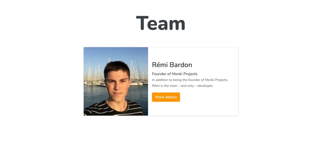
The old team members list (only in light mode)

The new team members list in light mode

The new team members list in dark mode
Team member page
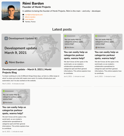
The team member page… nothing to say here, it was just ugly.
I redesigned it, and added the list of posts published by the author when appropriate, because it made a lot of sense 🤷. See how the cards don’t show the author… since we already know who the author is.
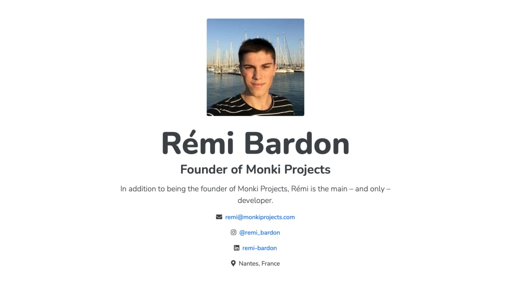
A member page with the old layout (only in light theme)
A member page with the new layout in light mode